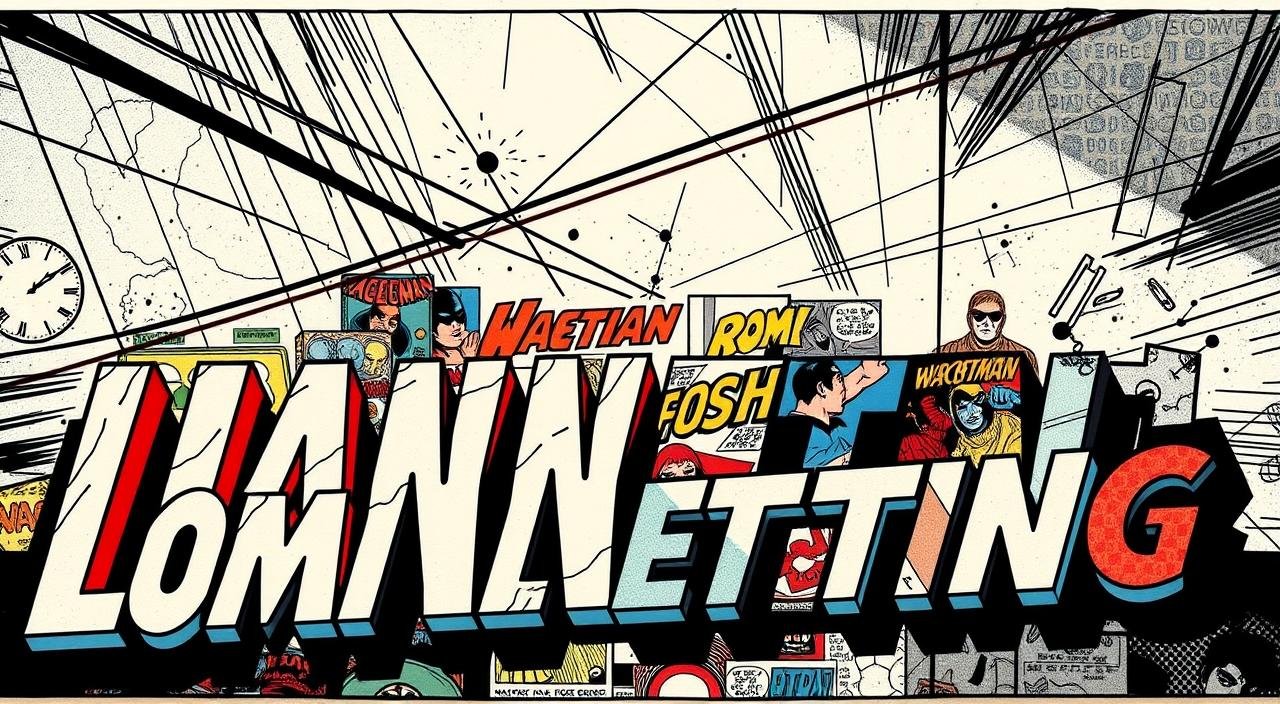
The Evolution of Comic Book Lettering Styles: From Hand to Digital Art Forms
I still remember the first time I held a 1970s comic book in my hands. The bold speech bubbles felt like secret codes, each curve of the text whispering stories about the artist’s craft. That moment sparked my lifelong fascination with how words dance across illustrated pages.
Early creators worked with tools that would make today’s artists gasp. They used rulers like the Ames Guide to hand-draw every word, shaping stories through calligraphy and patience.
I’ve spent hours trying to replicate those techniques – smudged ink and all – just to understand the magic behind those vintage pages.
But here’s what fascinated me most: how these methods transformed. By the 1990s, software like Adobe Illustrator let artists experiment freely.
Suddenly, sound effects could explode in 3D textures, and dialogue flowed with cinematic precision.
In this exploration, we’ll uncover how these changes reshaped storytelling itself. You’ll discover why certain classic styles still tug at our nostalgia, and how modern creators blend old-school charm with new possibilities.
Let’s decode the art that gives voice to our favorite heroes and villains.
Introduction to the Journey of Comic Book Lettering
It was a crumpled Spider-Man page that first made me notice the power of well-crafted words in panels. The way the jagged text mirrored Electro’s crackling energy taught me lettering isn’t just words—it’s visual music.

My personal encounter with lettering in comics
I spent weeks recreating that 1980s page’s uneven speech bubbles. My early attempts looked like alphabet soup! But through tracing and studying Marvel Masterworks editions, I discovered how curves and spacing control reading rhythm.
One botched balloon placement taught me more than any tutorial.
“Lettering is the bridge between art and reader—if it cracks, the story drowns.”
Why comic lettering matters in storytelling
Great design in comics isn’t just about art. Consider this:
| Element | Story Impact | Example |
|---|---|---|
| Balloon tails | Guides eye movement | Pointing toward speaker |
| Font weight | Conveys volume | Bold text for shouts |
| Kerning | Sets pacing | Tight spacing = urgency |
These choices shape how we feel scenes unfold. When Hulk’s roar fills a shattered bubble, the sound effects become part of the action. That’s the magic—lettering turns pages into theaters.
The Birth of Comic Lettering: Hand-Lettering Beginnings
Before specialized roles emerged, creators juggled pencils and pens to craft both visuals and text. I once examined a 1940 comic book where the artist’s shaky lines revealed their struggle with dual responsibilities. This multitasking birthed the first recognizable styles in the medium.

Historical roots of hand lettering
Newspaper strips from the 1920s show artists developing basic techniques. They used standard drafting tools like T-squares and nib pens.
Many drew dialogue directly onto pages to avoid extra production steps. This approach created raw, energetic text that matched the art’s personality.
The impact of early techniques and tools like the Ames Guide
Everything changed when professionals like Artie Simek entered the field. The Ames Guide became essential for spacing words evenly. I’ve tested this metal template – aligning letters becomes rhythmic, like typing on a visible grid.
“We didn’t just write words. We built architecture for the eye.”
These methods established rules still used today. Bold fonts emphasized punches, while tight kerning quickened action scenes. Though tools evolved, the craftsmanship from this era remains the soul of great comics.
The Role of Tools and Software in Comic Lettering
My first attempt at hand-lettering left my desk looking like a stationery store explosion. Pens, rulers, and erasers covered every surface—a stark contrast to today’s streamlined workflows. This messy journey taught me how tools shape both process and creativity.
Traditional tools vs. the digital revolution
Old-school methods required patience. I’ve used Ames Guides to align text and nib pens for organic curves. These techniques create warmth but demand hours of practice. Mistakes meant starting over—no undo button here!
| Aspect | Traditional | Digital | Impact |
|---|---|---|---|
| Consistency | Hand-drawn variations | Uniform spacing | Balances charm vs. clarity |
| Speed | 5 bubbles/hour | 20 bubbles/hour | Faster revisions |
| Creative Flexibility | Limited by physical tools | Endless font options | More experimental styles |
Digital programs changed everything. Vector-based text lets me resize dialogue without quality loss. Yet some artists miss the tactile joy of ink on paper—it’s a trade-off between efficiency and tradition.
My favorite software for lettering projects
After testing 12 applications, Clip Studio Paint became my go-to. Its balloon ruler feature creates perfect shapes in seconds. The customizable brush library mimics hand-drawn textures beautifully.
“Good software should feel like a collaborator, not a boss.”
For beginners, I recommend starting with free design tools like Inkscape. Watch tutorials on layer management—it’s crucial for organizing sound effects and dialogue. Remember: the best program is the one that helps your voice shine through.
comic lettering evolution digital: Transitioning from Hand to Pixel
The first time I imported a hand-lettered page into Photoshop, my scanner groaned like a betrayed librarian. This moment captured the industry’s shift—a blend of reverence for tradition and hunger for new possibilities.

Milestones in the digital transformation
Adobe Illustrator’s 1987 release changed everything. Artists could suddenly resize words without ink smudges. Early adopters faced skepticism—purists argued digital shapes lacked soul. But by 1994, DC Comics mandated digital files, cementing the shift.
| Year | Innovation | Impact |
|---|---|---|
| 1991 | First vector-based balloons | Precise scaling for reprints |
| 1998 | Custom SFX libraries | 3D explosion effects became standard |
| 2005 | Dynamic text warping | Curved dialogue matched action flow |
Modern guidelines still honor hand-drawn roots. I recently worked on a book where we used digital tools to mimic 1950s ink textures. The process felt like time travel—combining vintage charm with error-free editing.
“Digital didn’t erase craftsmanship—it just gave us a bigger toolbox.”
Today’s creators balance speed and artistry. Cloud collaboration lets teams adjust words across continents, while AI spacing tools maintain readability. Yet every project starts with a sketch—proof that pixels haven’t killed passion.
Mastering the Basics: Key Elements and Styles in Comic Lettering
I once ruined a perfectly good page by placing a whisper in bold letters—a rookie mistake that taught me how crucial balloons are to storytelling.
These visual containers shape how readers hear characters’ voices, from jagged-edged shouts to wispy internal thoughts.

Understanding speech balloons, thought bubbles, and narration boxes
Three core elements guide readers through panels:
| Element | Purpose | Best Practice |
|---|---|---|
| Speech balloons | External dialogue | Rounded edges, clear tails |
| Thought bubbles | Internal monologue | Cloud-like shapes, dotted tails |
| Narration boxes | Story context | Rectangular borders, subtle shading |
Sound effects like “KRAKOOM” need special handling. I angle them following action lines—a diagonal “SLASH” looks sharper than horizontal text. But restraint matters: too many effects clutter panels.
Tips for maintaining consistency and readability
Through trial and error, I’ve found three rules work best:
- Create a style guide for balloon sizes and fonts
- Use alignment grids to keep text parallel to panel borders
- Leave breathing room between words and balloon edges
“Great lettering disappears—it should feel effortless to read.”
When experimenting with styles, I test readability by squinting at pages. If I can’t distinguish captions from dialogue, it’s back to the drawing board. The magic happens when design serves the story, not the other way around.
Typography and Font Choices in Comics
I nearly lost a client once by using a playful script for a gritty detective story. The mismatch made their noir art feel like a birthday card—a harsh lesson in how fonts shape reader expectations. Typography isn’t just decoration; it’s silent narration.
How typography sets the tone in storytelling
Bold, angular fonts scream action. Rounded scripts whisper whimsy. I’ve seen a single typeface change a book’s mood entirely—like swapping a character’s voice actor mid-scene.
For horror projects, jagged text with uneven baselines creates unease. Romance? Flowing cursive pulls readers into intimate moments.
| Font Style | Emotional Impact | Best Use |
|---|---|---|
| Blocky Sans-Serif | Urgency | Superhero battles |
| Handwritten Script | Personal tone | Diary entries |
| Retro Serif | Nostalgia | Period pieces |
Balancing artistic flair with legibility
My golden rule: style serves substance. I once designed a beautiful alien font that readers couldn’t decipher. Now I test all lettering at thumbnail size. Professional letterers follow strict guidelines—minimum 9pt text, consistent stroke weights, and clear balloon tails.
“Your font should whisper ‘look at me,’ not scream ‘what am I?’”
When creating custom fonts, I balance uniqueness with familiarity. A mutant’s speech might use distorted letters—but still maintain readable shapes.
Always check credits and licenses! That free font? It might belong to a designer who requires attribution. Tools like FontForge help craft original typefaces while respecting artists’ rights.
Legal and Licensing Considerations for Comic Fonts
I once received a cease-and-desist letter for using a font I’d downloaded “for personal use.” That wake-up call taught me legal knowledge is as crucial as artistic skill in this field. Understanding rights and permissions protects your work and respects other creators.
Navigating font licensing and credit requirements
Not all fonts are free for commercial projects. Many require paid licenses or specific credits. I learned this the hard way when a publisher rejected my book draft due to unauthorized typeface usage. Now I always check:
| License Type | Commercial Use | Credit Needed? |
|---|---|---|
| Open Source | Yes | Sometimes |
| Desktop | Limited | No |
| Webfont | No | N/A |
Professional letterers often create custom fonts to avoid these issues. When using existing typefaces, include attribution in your book’s colophon or credits page. One indie creator I know lists fonts like cast members—it’s smart and respectful.
Avoiding legal pitfalls in digital lettering
Free font websites can be minefields. I now use platforms like Adobe Fonts or Google Fonts—their licenses are clear. For collaborative projects, maintain records of all font purchases.
A colleague once faced fines because their colorist used an unlicensed font on shared files.
“Assume every font is copyrighted until proven otherwise.”
When in doubt, consult a legal professional. Many design communities offer template agreements covering font usage. Remember: protecting your work starts with respecting others’ rights.
Integrating Modern Techniques with Traditional Appeal
Walking through a modern comic shop feels like time travel—sleek digital pages whisper alongside rugged vintage editions. Today’s creators blend crisp vector tools with ink-stained nostalgia, proving innovation doesn’t erase heritage.
Where pixels meet paper grain
My latest project required a 1950s aesthetic with modern readability. I sketched balloons by hand, then scanned them into Illustrator. The result? Text that breathes like old newsprint but scales perfectly for digital readers. This hybrid process preserves quirks while fixing alignment issues.
| Traditional Element | Digital Enhancement | Outcome |
|---|---|---|
| Hand-drawn textures | Layer blending modes | Warmth without scan artifacts |
| Irregular bubbles | Vector smoothing | Organic shapes, crisp edges |
| Brush lettering | Pressure-sensitive tablets | Human touch in digital files |
Tools like advanced design software let me experiment freely. Last month, I created crumbling stone text for a medieval fantasy—first chiseling letters in clay, then digitizing the impressions. The art director cried happy tears.
“We’re not replacing craftsmanship—we’re giving it superpowers.”
Three ways I balance eras:
- Use scanned pencil guidelines under digital text
- Mix custom brush presets with font libraries
- Print drafts for tactile editing sessions
The right choice depends on the story’s soul. A gritty noir might need smudged ink effects, while sci-fi demands glowing holographic text. By maintaining a variety of approaches, we honor comics’ rich history while pushing boundaries.
Conclusion
Holding a vintage lettering nib last week, I marveled at how these simple tools shaped entire universes of dialogue. From hand-drawn text to pixel-perfect fonts, every era’s styles reveal deeper truths about storytelling itself.
Choosing the right font isn’t just about aesthetics—it’s about giving characters a voice. The process matters: crisp words in well-placed balloons guide readers through panels like signposts. Even sound effects become part of the art, their jagged edges amplifying punches or whispers.
Modern creators face a thrilling challenge. How do we honor inky traditions while embracing efficient design workflows? My answer: treat tools as partners, not replacements. Clip Studio Paint’s precision complements hand-sketched textures beautifully.
To fellow designers: stay curious. Dive into tutorials, absorb industry information, and let each page teach you something new. The best stories emerge when craft meets experimentation.
This journey—from nibs to tablets—isn’t ending. It’s evolving, one bold shape at a time. Keep shaping voices that leap off the page.
FAQ
Q: Why do speech balloons and fonts matter so much in storytelling?
A: They guide the reader’s eye and set emotional tones. A jagged font for shouting or soft curves for whispers adds layers to the narrative without extra artwork.
Q: What tools do professionals use today compared to the Ames Guide era?
A: While tools like the Ames Guide helped align hand-drawn text, most creators now rely on software like Adobe Illustrator or Clip Studio Paint. These programs offer precision and flexibility that streamline the process.
Q: How do I avoid legal issues when selecting fonts for my project?
A: Always check licensing terms—some fonts require purchase or attribution. Sites like Blambot specialize in comic-friendly typefaces with clear usage guidelines, reducing legal risks.
Q: Can digital lettering still capture the charm of hand-drawn styles?
A: Absolutely! Many artists use custom brushes or vector tools to mimic organic textures. Balancing digital efficiency with intentional imperfections keeps that nostalgic feel alive.
Q: What’s the biggest challenge when transitioning from hand to pixel-based workflows?
A: Letting go of tactile control was tough for me initially. Trusting software features like kerning presets or balloon templates takes practice but speeds up revisions dramatically.
Q: How do typography choices influence a reader’s experience?
A: Fonts act as silent narrators. Bold, blocky text can signal urgency, while cursive scripts might hint at fantasy. Consistency in style ensures the story remains immersive and easy to follow.