Why Comic Book Typography Matters More Than You Think
Typography is like the invisible storyteller in comic design. It guides readers through a story smoothly. But, if ignored, it can mess up the whole reading experience.
Comic typography is more than picking fonts at random. It’s a key tool for visual communication. It changes how readers see and connect with your stories. Every detail, from letters to bubbles, is crucial.
Think about reading a comic where text doesn’t match the artwork. Fonts that clash with character feelings or hard-to-read dialogue can be a problem. Professional comic creators know that typography is a big part of telling a story.
In this guide, you’ll learn how to make your comic typography stand out. We’ll cover everything from choosing the right fonts to where to place them. You’ll see how typography can grab attention, improve the story flow, and keep readers engaged in your world.
Understanding the Fundamentals of Comic Typography
Comic book design is all about lettering styles that make stories come alive. Typography in comics is more than just text. It’s an art form that shows emotion, tone, and the rhythm of the story.
Starting your comic typography journey means learning its basics. Comics use text placement and creative lettering to turn words into powerful storytelling tools.
Basic Elements of Comic Lettering
Comic lettering has key parts that make it special:
- Character design of letters
- Spatial arrangement of text
- Interaction between text and artwork
- Emotional expression through typography
The Evolution of Comic Book Typography
Lettering styles have changed a lot since comics began. From hand-drawn to digital tools, comic design has grown with technology while keeping its art.
Digital vs Traditional Lettering Approaches
Today, comic creators have two main ways to letter:
| Traditional Lettering | Digital Lettering |
|---|---|
| Hand-drawn techniques | Software-based creation |
| Unique, organic feel | Precise, easily editable |
| Limited reproduction options | Infinite reproducibility |
Each method has its own benefits. Artists can pick what fits their vision and project needs best.
Comic Typography Readability Importance
Typography is the silent storyteller in comic design. It can make or break reader engagement. Comic typography readability is more than just being easy to read. It’s about creating an immersive story that pulls readers in.
When you work on comic typography, focus on these key aspects:
- Visual flow that guides the reader’s eye naturally
- Font choices that match character personalities
- Text sizing that complements panel artwork
- Strategic placement of dialogue and sound effects
Understanding the importance of comic typography means seeing how text works with visual storytelling. Your typography can communicate emotion, tone, and pacing more than the words do. A well-designed comic uses typography to add rhythm, highlight key moments, and keep readers engaged.
“Typography is the art of making words readable, memorable, and visually compelling.” – Comic Design Expert
Professional comic creators know that good typography makes a great comic even better. By focusing on clear, intentional text design, you keep readers hooked in the story. This way, they stay engaged without getting tired or confused.
Essential Font Selection Principles for Comics
Choosing the right fonts is crucial for your comic’s success. The fonts you pick affect how easy it is to read. This makes your story flow smoothly for your readers.
Creating a great comic means picking fonts that fit your story’s vibe. Knowing how to use typography can make your story even more powerful.
Choosing Character-Appropriate Fonts
Each character should have a font that shows who they are. Here are some tips:
- Match font personality with character traits
- Use distinct typography for different characters
- Ensure readability remains paramount
Maintaining Consistency Across Panels
Keeping your fonts consistent helps your comic look unified. Choose fonts that:
- Align with overall narrative tone
- Create visual harmony
- Support smooth reading flow
Font Size and Spacing Guidelines
Make your text easy to read by using the right font sizes and spacing. The right font size lets readers enjoy your story without eye strain.
Remember, font legibility is more than just looks. It’s about making your story a fun, immersive experience for your readers.
Speech Bubble Design and Placement
Speech bubbles are key in comic book design. They turn silent panels into lively conversations. This makes the artwork and story come alive. Knowing how to design them well can make your comic’s story even better.
Creating great speech bubbles needs careful thought. Here are some important things to consider:
- Shape selection that matches character emotion
- Appropriate sizing for dialogue length
- Precise placement within panel composition
- Visual flow that guides reader’s eye
Different bubble styles tell different stories. Jagged-edged bubbles show anger or tension. Smooth, rounded edges mean calm conversations. Your comic should use these visual hints to show how characters talk.
Where you put speech bubbles is very important. They should keep the panel balanced and not get in the way. Readers should easily move from the dialogue to the artwork without feeling lost.
Effective speech bubbles are like invisible bridges connecting characters and readers.
Here are some tips for designing speech bubbles:
- Align bubbles with character speaking direction
- Use consistent typography
- Create clear reading paths
- Minimize text overlap with critical artwork
Mastering speech bubble design can turn your comic into a deep storytelling experience.
Creating Visual Hierarchy Through Typography
Typography is more than just text in graphic storytelling. It’s a key part of visual communication, helping readers follow your comic’s story. Good typography makes it easy to follow the story from panel to panel.
Creating a strong visual hierarchy needs careful planning and creativity. Your choice of typography can change how readers see and understand your comic’s story.
Establishing Reading Flow
For a smooth reading experience, know how people scan visual content. Your typographic choices can guide their attention and make it easy to move through the comic.
- Use consistent font styles for different characters
- Vary text size to indicate emotional intensity
- Align text to complement panel composition
Balancing Text with Artwork
The balance between text and artwork is key in graphic storytelling. Your typography should add to the story, not take over. By choosing the right placement and size, text can blend well with the artwork.
Using Typography for Emphasis
Typography can make emotional moments and important story points stand out. Strategic font variations can show whispers, screams, excitement, or tension without words.
- Bold fonts for intense moments
- Italicized text for internal thoughts
- Varied letter spacing for unique emotional states
Typography’s Role in Emotional Expression
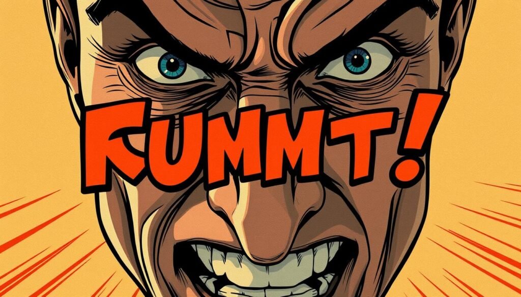
Typography in comics is more than just text. It’s a way to express feelings deeply. The font, size, and weight you choose can show a character’s feelings without words.
Each lettering style brings out different emotions in comics. Bold fonts can show anger or intensity. Thin fonts might show vulnerability or quiet thoughts. When typography speaks to our feelings, it makes comics more engaging.
- Uppercase letters convey shouting or extreme emotions
- Italicized text suggests internal thoughts or subtle emphasis
- Varied font sizes create dynamic emotional landscapes
Comic artists use typography to add depth to stories. Panic might be shown with jagged letters, while calm talks have smooth fonts. These small changes make the story’s emotions feel real to readers.
| Emotion | Typographic Technique | Visual Impact |
|---|---|---|
| Anger | Bold, Sharp Fonts | Intense, Aggressive |
| Fear | Trembling, Irregular Letters | Nervous, Unstable |
| Excitement | Large, Dynamic Fonts | Energetic, Vibrant |
Understanding how typography expresses emotions helps you create powerful comics. Your lettering is not just text; it’s a tool that connects readers to characters’ feelings.
Accessibility Considerations in Comic Typography
Making comics for everyone means focusing on typography accessibility. You want to make text that welcomes all readers, ensuring it’s easy to read for everyone.
Creating accessible comics is more than just picking pretty fonts. It’s about making sure everyone can enjoy your story, no matter their visual abilities.
Font Legibility Standards
When picking fonts for your comics, keep these tips in mind:
- Go for sans-serif fonts for better reading
- Use a font size of at least 10-12 points
- Keep the letter spacing even
- Avoid fonts that are too fancy or hard to read
Color Contrast Requirements
How well text shows up depends a lot on color contrast. Here’s how to make your text easier to read:
| Contrast Ratio | Accessibility Level | Recommended Use |
|---|---|---|
| 4.5:1 | Minimum Standard | Body text |
| 7:1 | Enhanced Readability | Critical information |
| 3:1 | Large Text | Headings and titles |
Typography for Different Reading Devices
Digital comics need to work well on all devices. Test your comic on different screens to make sure it looks good everywhere. Use design that adjusts well on phones, tablets, and computers.
“Accessibility in typography is not a limitation, but an opportunity to create more inclusive storytelling.” – Design Accessibility Expert
By focusing on making your text clear and easy to read, you’ll reach more people. This way, your comics can welcome a wider audience, making your story more inclusive.
Typography’s Impact on Narrative Pacing
Typography is a key tool in graphic storytelling. It brings your story to life. Your font choices, text placement, and density can change how readers experience your story.
Think about how typography affects your comic’s story pace. Different text styles evoke different emotions:
- Tight, compact lettering speeds up action scenes
- Wide, open text slows down key moments
- Different font sizes draw the reader’s eye
When you create your graphic story, see typography as a silent narrator. Larger fonts build tension, while smaller fonts add subtlety. Your typography sets a visual pace that guides readers through your story’s emotions.
Mastering typographic pacing needs careful planning. Important techniques include:
- Changing text density in panels
- Using white space for breathing room
- Matching fonts with character traits
By grasping typography’s power, you turn simple text into a dynamic storytelling element. This boosts reader engagement and elevates your graphic storytelling.
Best Practices for Sound Effects and Action Words
Mastering sound effects and action words is key in comic book design. Your lettering can turn a simple panel into an explosive moment. The right typography brings every pow, crash, and whoosh to life.
When creating sound effects, keep these tips in mind for dynamic comic book design:
- Match the font style to the sound’s intensity
- Use size and angle to amplify emotional impact
- Integrate effects seamlessly with artwork
- Select fonts that complement character personalities
Sound effect typography needs careful thought. You aim to create visual noise that feels natural and powerful.
| Sound Type | Recommended Typography Approach | Visual Impact |
|---|---|---|
| Explosive Sounds | Bold, jagged fonts | High energy, sharp angles |
| Soft Sounds | Thin, flowing letterforms | Subtle, gentle movement |
| Mechanical Noises | Angular, geometric fonts | Precise, structured feel |
Try out different lettering styles to find unique ways to show sound. Remember, typography in comics is more than text. It’s a powerful tool that connects readers emotionally with the story.
Integrating Typography with Visual Elements
Making a great comic book design is all about mixing text and pictures well. How you mix these two things makes the story come alive. Experts in comic books know that fonts are more than just letters. They help tell the story in pictures.
- Put text where it fits with the pictures
- Make sure the fonts match the mood of the scene
- Use different fonts to show importance
Panel Layout Considerations
Your panel layout should lead the reader’s eye smoothly. Placing text wisely can make the story flow better and keep readers interested. Think of text as another picture that works with the illustrations.
Text-to-Image Ratio Management
It’s important to balance text and pictures. Too much text can mess up the pictures, and too little can confuse readers. Find a balance where both text and pictures help tell the story.
White Space Utilization
White space is not just empty space. It’s a key design tool. It can:
- Make reading easier
- Give pictures room to breathe
- Guide the reader’s eye
Use white space to make your comic’s story clearer.
Conclusion
Your journey in graphic storytelling starts with understanding the importance of comic typography. It’s not just about the pictures; it’s about making the story easy to follow. This makes readers want to keep reading.
Typography is like a silent guide in your comic. It helps readers move through each panel smoothly. With the right font, spacing, and design, your comics can become more than just pictures. They can tell a story that touches your audience’s hearts.
Learning about comic typography is a journey. It’s about trying new things and getting better with each panel. Every panel is a chance to make your story clearer, more emotional, and unique. See typography as a key tool in your storytelling.
Keep improving your skills and try new things. Your dedication to typography will make your work stand out. In the world of visual stories, this will help you shine.
FAQ
Q: What makes typography so important in comic creation?
A: Typography is key in comics because it affects how easy they are to read. It also helps keep readers engaged and enhances the story. Good typography guides the reader’s eye and shows character emotions, making the story more immersive.
Q: How do I choose the right font for my comic?
A: Pick fonts that fit your characters and story’s mood. Think about how easy they are to read and if they look good in each panel. Choose fonts that are clear and match your comic’s style, avoiding ones that are too fancy.
Q: What’s the difference between digital and traditional lettering?
A: Traditional lettering is drawn by hand, giving a unique feel but takes time. Digital lettering is quicker, easier to edit, and consistent. Decide based on your style and project needs.
Q: How can typography help convey emotions in comics?
A: Typography can show emotions through bold text, different sizes, and custom styles. These techniques help share a character’s mood and the scene’s atmosphere, adding depth to your story.
Q: What are the key considerations for speech bubble design?
A: When making speech bubbles, think about their shape, size, and where they go. They should lead the reader’s eye and fit with your art. Different styles can show different tones, making your story better.
Q: How can I improve the accessibility of my comic’s typography?
A: Use fonts that are easy to read and have good contrast with backgrounds. Make sure your comic looks good on different devices. Choose fonts and sizes that are clear for everyone, including those with vision problems.
Q: What’s the best way to handle sound effects and action words?
A: Pick fonts that make sound effects and action words pop without feeling forced. Think about size, placement, and style to show the sound’s intensity. Your goal is to make the typography dynamic and engaging.
Q: How do I create a visual hierarchy in my comic’s typography?
A: Make a clear path for the reader’s eye by placing text well and using typography. Balance text with art to avoid too much. Use size, bolding, or placement to highlight important parts and dialogue.
